Are you looking for a fast and easy process of creating an org chart (organizational chart) for your business? An org chart can help you out to display your company’s overall structure. For instance, employees’ roles and reporting structures to the overall business strategy. Well, Google sheets hold this solution for you. By following built-in features, you can easily make org charts in Google sheets.
To the entire article, you’ll walk through making an organization chart (org chart) using Google sheets built-in method. And for doing so, at first, you need to prepare a data format on which you wish to create an org chart so that the correct relationship will display. Once you have your data prepared, then making the org chart is just a matter of no time.
Make Org Charts in Google Sheets
An organizational chart is usually created to show the company’s underlying structure. So before making it let’s create a set of data on which you would like to have an org chart. And make sure you’ve put your information in the sheets correctly.
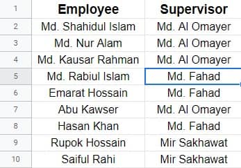
In my case, I’ve prepared the below sheets as a demo to show you the whole process. In column A, the name of every person whom I want to show in my chart. And in column B, the name of their respective supervisors to whom they report their working progress.

Well, as you have your demo data, then let’s dive into the process of how to make org charts in Google sheets with these data. However, as you have your data, now Google sheets take no time to make an organizational chart out of this. Let’s start with the process.
1. To begin with, select the whole datasheet and click on Insert from the top of the menu bar. Now, select Chart from the resulting page.
2. Well, after tapping on Chart, right you must be on the below-attached page. Remember, after clicking on Chart, a default chart will appear on your sheets. But to make org charts in google sheets, you need to have some more clicks.
However, a Chart editor page will open on which you can see an option called Chart type. Now, hover over your mouse on the chart type drop-down menu, and start scrolling all the options. And you’ll find the chart you’re looking for in the Other section. Just select to have your org chart in your sheets.
3. Well, here your process completes. An org chart will appear on your Google sheets like the below one. Now, check everything is organized or not. If not, then you must put any data wrong. However, you can easily resize and place this chart by dragging it from the corner or edge.
How to Customize Your Organizational Chart (Org Chart)?
Yes, once you create your org charts in Google sheets, you can customize that as well. It’s not like once in a lifetime. And to edit/customize your organizational charts, you just need to do some clicks. That’s it.
1. At first, find 3 dots at the right of the top on your org chart. Click on that to have further options. Now, as you’ve got the options, select Edit chart.
2. You’ll see a page like the below-attached one in this step. Click on Customize, and expand the Org dropdown. Two options will appear, Size and Node color. Set the size (Small, Medium, and Large) and node color of your chart as you want.
Wrapping Up
To sum up, showcasing your data into a visual chart is much easier to understand than the data and all. And, Google sheets holds that feature for doing so. From now, you’ll be able to make org charts in Google sheets and present your data in an eye-catching and easily understandable way.
Well, I’m taking leave for now. I will be back with another Google sheets trip and tricks. If you find this helpful, then do share it with your friends, family, and colleagues. On top of this, if you’re familiar with any other process, then please let me know in the below comment box.